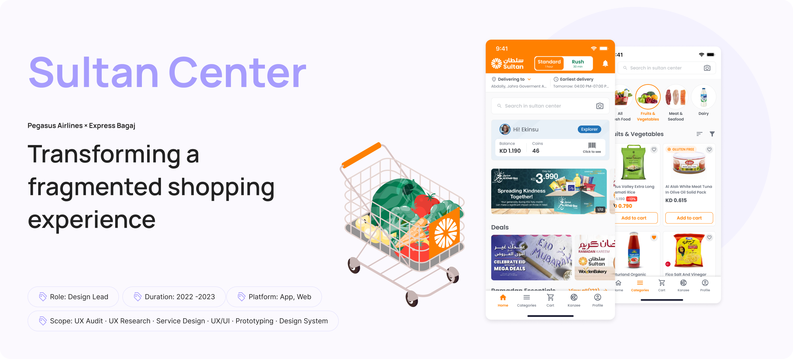
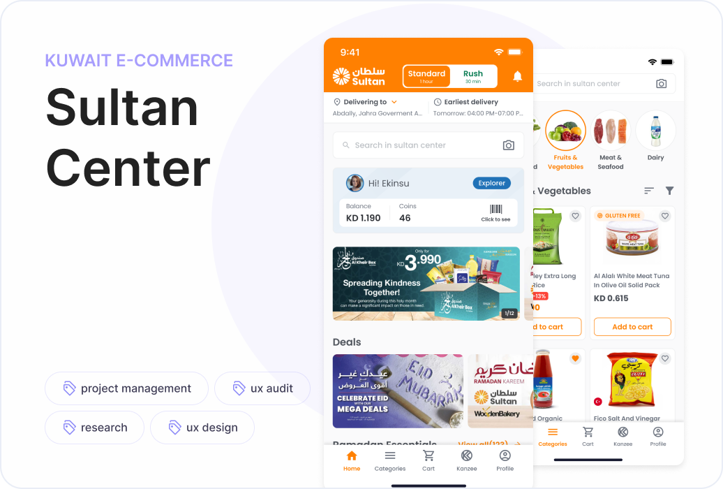
Redesigning the online grocery experience
for Sultan Center
From product discovery to checkout, Sultan Center was redesigned to create a clearer, more intuitive and scalable shopping experience across web and mobile.
A familiar shopping experience that had become difficult to navigate
Sultan Center had been serving customers across Kuwait through its digital shopping experience for several years.
But as the product evolved, the experience had become increasingly difficult to navigate.
Inconsistent interface patterns, unclear hierarchy, a complex checkout flow and gaps in the mobile experience created friction throughout the shopping journey.
The challenge wasn't simply to redesign the interface.We needed to rethink how customers discover, evaluate and purchase products across the entire digital experience.
01 — The Challenge
From understanding the problems to shaping the experience
As Design Lead, I was involved throughout the design process, from UX audit and research to experience definition, prototyping and interface design.
My responsibilities included:
- UX audit & heuristic evaluation
- Competitive research
- Stakeholder workshops
- User research & insight mapping
- Persona & empathy mapping
- Customer journey analysis
- Information architecture
- Use cases & user flows
- Wireframing
- Prototyping & usability testing
- UX/UI design
- Design system direction
- Collaboration with the design team and stakeholders
The goal was to move from isolated interface improvements toward a more coherent shopping experience across the product.
02 — My Role
Before redesigning the interface, we mapped where the experience was breaking
We started with a UX audit of the existing web and mobile experiences.
The review revealed several recurring problems:
- Confusing navigation and category structures
- Weak visual and interaction hierarchyInconsistent CTA patterns
- Low-contrast interface elementsLimited search experience
- Insufficient product information
- Friction throughout the cart and checkout journey
- Gaps between web and mobile experiences
Rather than treating these as individual UI problems, we looked for the underlying experience patterns behind them.
The audit became the foundation for deciding what needed to change — and why.
03 — Understanding the Existing Experience
Turning research observations into design opportunities
Research findings and UX audit observations were mapped to make the problems visible and actionable for everyone involved in the project.
We combined these insights with stakeholder workshops to align on business requirements, understand operational needs and identify potential opportunities.
This helped us move from:
What is wrong?
to:
What should the experience enable users to do better?
The resulting opportunity areas shaped the direction of the redesign.
04 — From Findings to Opportunities
One grocery experience, different reasons to shop
Our research highlighted that customers don't all approach grocery shopping in the same way.
Some users know exactly what they want.
Others browse categories, compare products, look for promotions or search for healthier alternatives.
We translated these different behaviours into personas and empathy maps to better understand their needs, motivations and frustrations.
This helped us design an experience that could support both purposeful shopping and discovery.
05 — Designing Around Different Shopping Behaviours
Making a large product catalogue easier to understand
A grocery platform can quickly become overwhelming when hundreds of products, categories and offers compete for attention.
We therefore revisited the information architecture and navigation structure to create clearer relationships between:
Categories
Products
Search
Promotions
Recipes
Cart
Checkout
The aim was to help users understand where they are, what they can do next and how to get back to where they were.
06 — From Navigation to Information Architecture
Search should help users discover, not just find
The existing search experience left a large part of the screen underutilised.
Instead of treating search as a simple input field, we explored ways to make it a starting point for discovery.
The new approach introduced:
- Suggested searches
- Recently searched products
- Popular searches
- Recommended products
- Category shortcuts
- Relevant promotional content
Search became more contextual — helping users continue their journey even before they knew exactly what to type.
07 — Designing a More Useful Search Experience
Helping users compare before they commit
Product detail pages needed to provide enough information for users to make confident decisions.
We introduced stronger content hierarchy and clearer relationships between:
- Product information
- Pricing
- Promotions
- Specifications
- Reviews
- Recently viewed products
- Related products
- Recipes
Frequently bought together
The product page evolved from a static information screen into a decision-making space.
08 — Making Product Decisions Easier
Reducing friction at the most critical part of the journey
The checkout experience contained several points of friction — from delivery information and time-slot selection to payment.
We redesigned the flow around a clearer sequence:
Cart → Address → Delivery Slot → Payment → Confirmation
Important information remained visible throughout the journey, while actions and system states were given clearer hierarchy.
We also introduced contextual behaviours such as:
Similar product suggestions for out-of-stock items
Cart-specific promotions
Delivery threshold messaging
Alternative payment methods
Wallet and loyalty benefits
Clear order confirmation and status
The goal was to make checkout feel predictable rather than transactional.
09 — Redesigning the Cart & Checkout
Establishing a system before scaling the screens
Once the core experience and interaction patterns were defined, we moved into wireframing and prototyping.
This allowed us to validate key journeys before investing in the final visual layer.
The interface design was then developed around a consistent visual language and reusable components.
A design system approach helped establish consistency across:
- Web
- MobileProduct cards
- Navigation
- Forms
- CTAs
- Cart components
- Checkout patterns
- Feedback and system states
This created a stronger foundation for scaling the product beyond individual screens.
10 — From Wireframes to a Scalable Interface
One experience, adapted to different contexts
Sultan Center's experience needed to work across both responsive web and mobile applications.
Rather than simply shrinking desktop layouts, we considered how navigation, product discovery, cart management and checkout behaviours should adapt to smaller screens.
The result was a more consistent experience across touchpoints while respecting the interaction patterns of each platform.
11 — Designing Across Web & Mobile
Connecting the entire journey
The redesign brought together the different parts of the shopping experience into one connected system.
Search connects to products.
Products connect to recommendations.
Recommendations connect to the cart.
The cart connects to delivery.
Delivery connects to checkout.
And checkout connects back to the customer's order journey.
Instead of designing screens independently, we designed the relationships between them.
12 — From Fragmented Screens to One Shopping Experience
A stronger foundation for a more intuitive grocery experience
The project transformed Sultan Center from a collection of inconsistent digital interactions into a more structured and scalable shopping experience.
We established a clearer information architecture, stronger interaction patterns and a more consistent visual system across web and mobile.
More importantly, the redesign created a foundation that could support future features and product growth without continuously adding complexity.
From a fragmented shopping experience to a clearer, more connected and scalable digital product.
13 — The Result