Express Bagaj was a complex airport service where digital interfaces, physical equipment and passenger behaviour had to work together.
I led the project and design direction from discovery and field research through service design, experience strategy, prototyping and validation.
The UI execution and design system were developed together with the Appcent Design Team under my direction.
The problem wasn't only on the screen
Express Bagaj combined self-service kiosks, baggage weighing, tag printing and physical bag drop.
Through field observations and stakeholder workshops, we identified problems that couldn't be understood by looking at the interface alone.
Passengers could encounter incomplete sessions, miss important actions, struggle to understand whether a flight or baggage belonged to them, or apply baggage tags incorrectly.
At the same time, the physical kiosk layout created large unused areas while important actions were positioned in places that were easy to overlook.
The challenge was to redesign the experience around what actually happened in the airport — not simply redesign the existing screens.
01 — Challenge
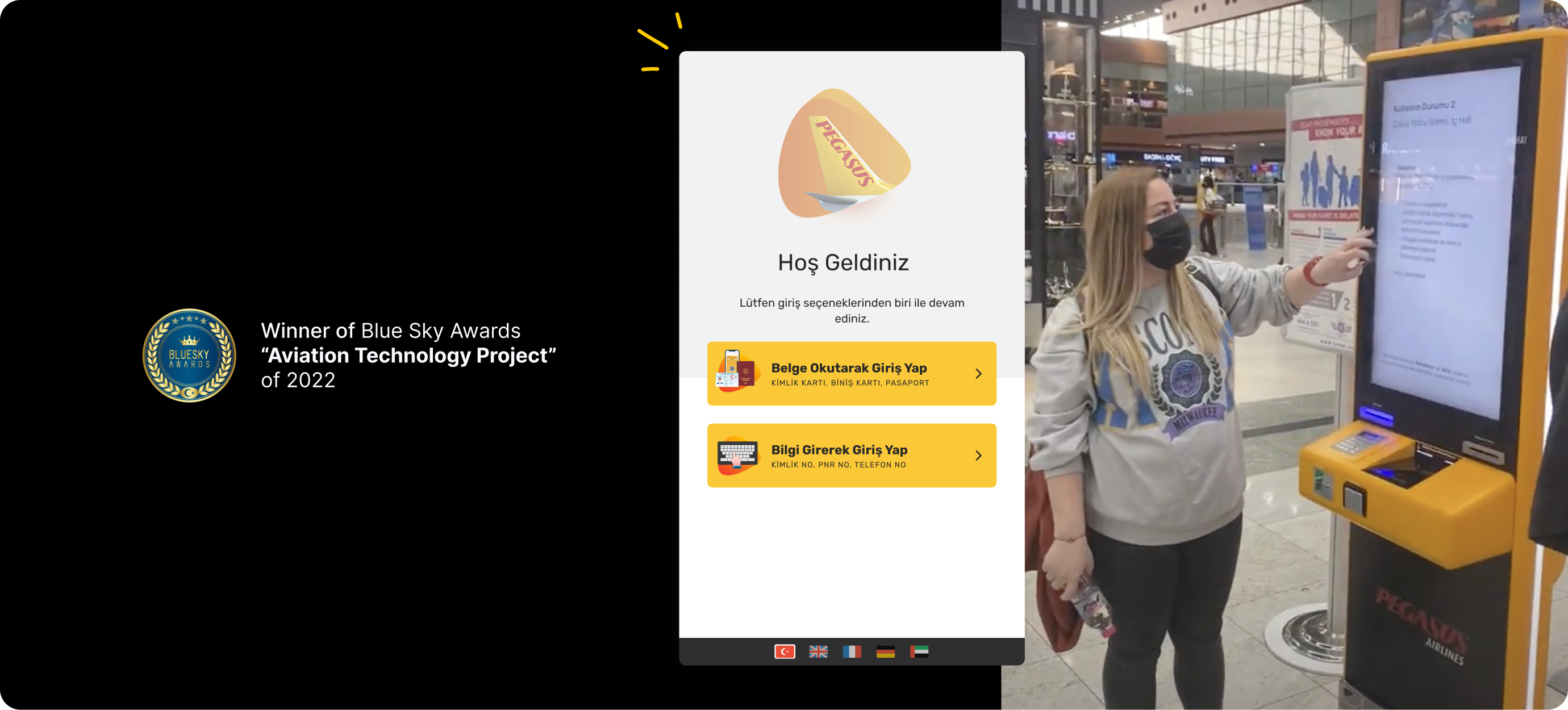
Going into the field before designing
I led the discovery process by combining stakeholder workshops, existing experience analysis and field observations.
Being in the airport helped us see behaviours that weren't obvious from analytics or screen flows alone.
We observed where passengers hesitated, where they needed staff support, how they interacted with the kiosk and where the physical environment influenced their decisions.
These observations became the basis for the experience principles and design decisions that followed.
02 — research
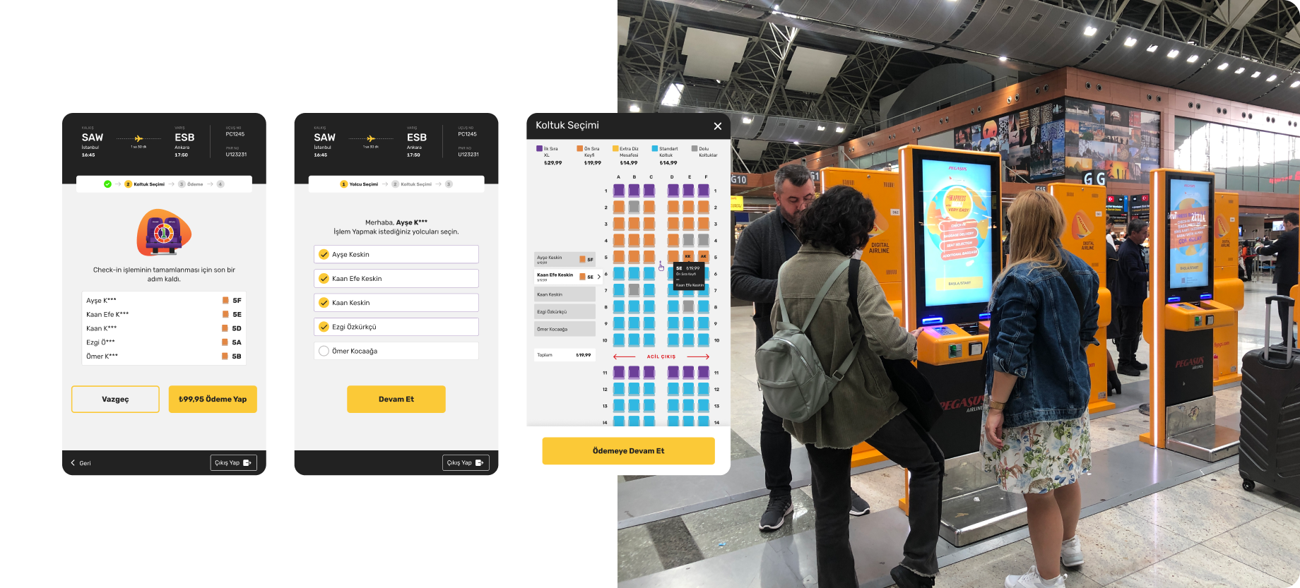
Making it clear who the journey belongs to
One of the problems we observed was that passengers could continue a process left incomplete by the previous user.
The challenge was balancing two needs: protecting passenger privacy while still giving the current passenger enough information to recognise whether the journey belonged to them.
I redesigned the information hierarchy and introduced contextual summary cards so passengers could confirm the relevant flight and journey without exposing unnecessary personal information.
The goal was simple: make the context visible before the passenger continues.
03 — sessıon continutiy
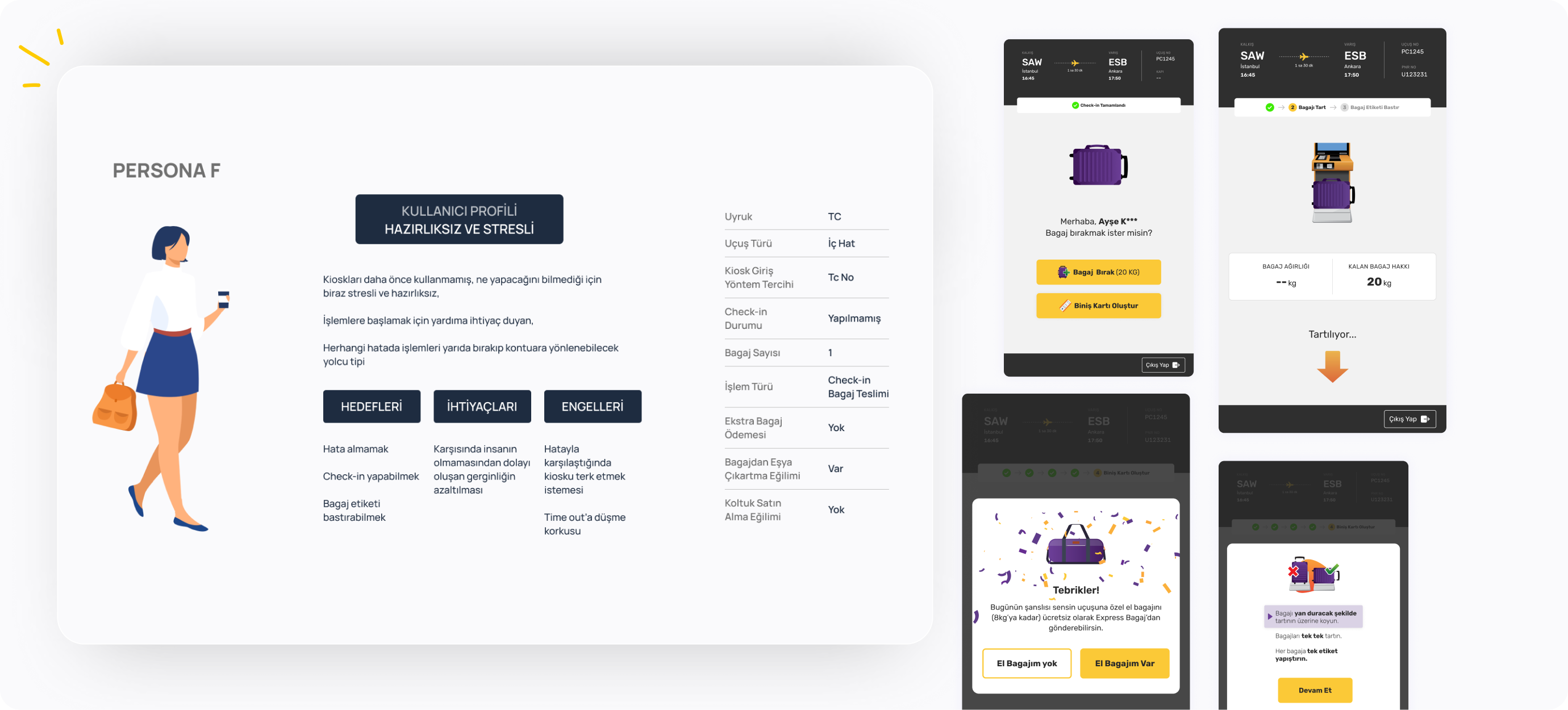
Designing within the physical constraints
The kiosk hardware couldn't simply be redesigned, so the interface had to work with its physical limitations.
The existing layout left significant areas unused, while important actions were fixed at the bottom of the screen and could easily go unnoticed.
Based on field observations, I defined a new interaction structure that used the available space more intentionally and brought important information and actions into more visible positions.
We also established a layout grid to create consistency across different journey states.
04 — kıosk
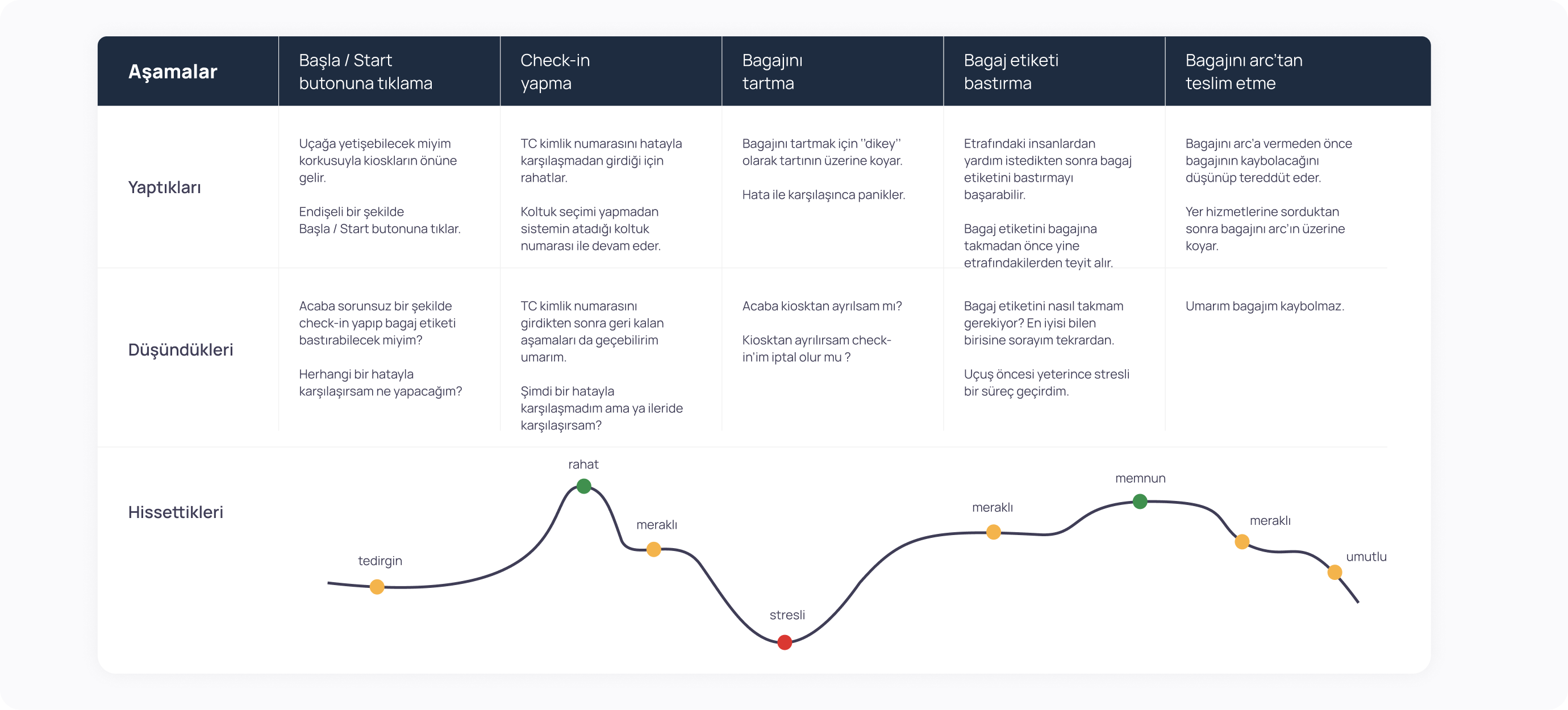
Turning a known operational problem into a guided interaction
Incorrect baggage tagging was one of the pain points identified through field observations and discussions with business owners.
Instead of treating the baggage scale as a passive step, we redesigned the interaction to actively guide the passenger through the process.
I defined an animated baggage weighing experience that showed what was happening, what the passenger needed to do and when the process was complete.
The interaction was later observed in the field, where passengers were able to follow the new guidance as intended.
Rather than claiming a specific reduction in errors without supporting data, the strongest evidence we had was behavioural: the redesigned interaction was understood and used correctly in the observed sessions.
05 — baggage tag
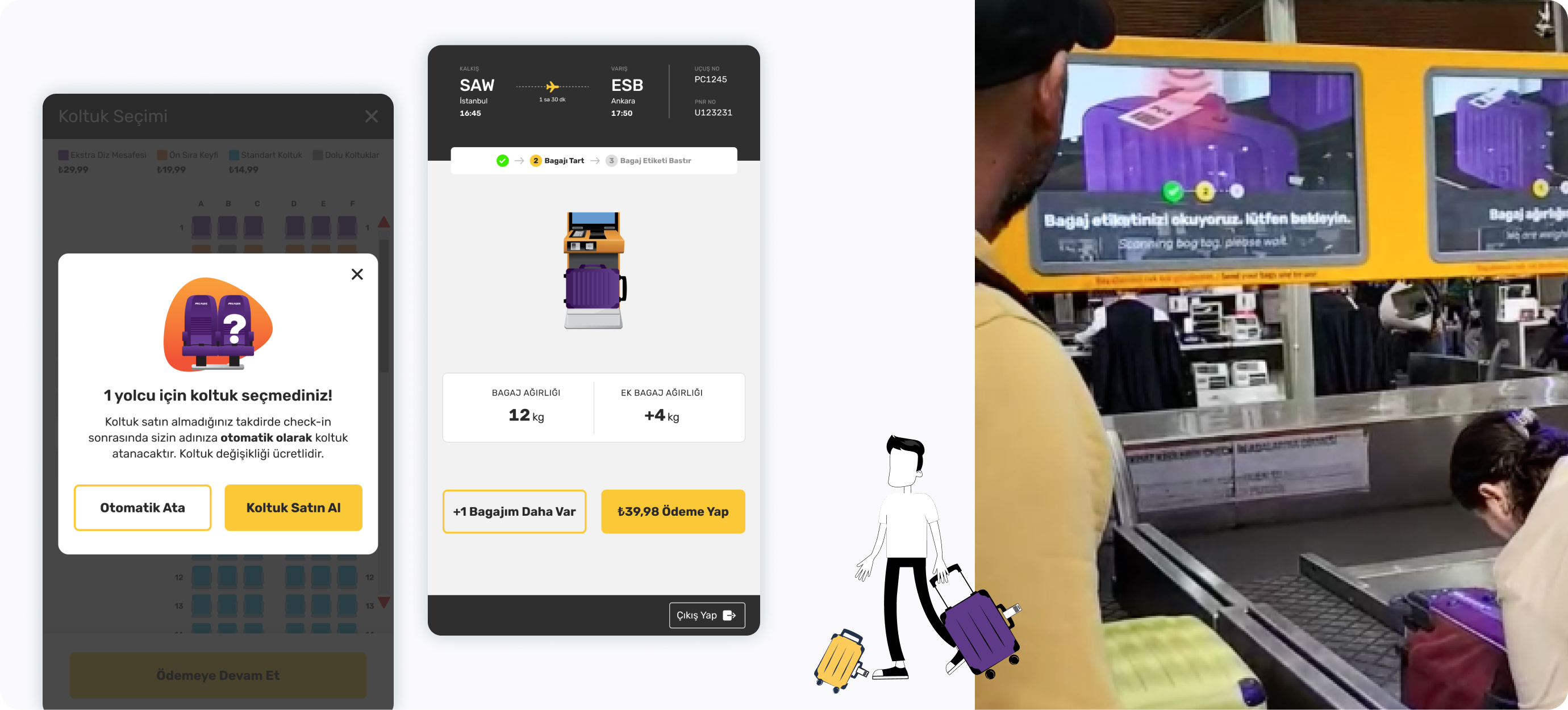
Designing the service, not just the interface
The baggage journey continued beyond the kiosk.
At the bag drop stage, passengers interacted with the physical equipment, screen, baggage and environment at the same time.
I led the experience direction across these touchpoints, using animation, sound, visual feedback and physical positioning to make system states easier to understand.
The aim was to answer a simple question at every moment:What just happened, and what should I do next?
06 — beyond the screen

Creating a flexible foundation for new services
The redesign also needed to support new commercial and operational journeys without disrupting the core baggage experience.
I defined how additional services such as paid seat selection and additional baggage could be introduced into the journey.
Rather than designing each feature as a separate screen, we created reusable journey patterns that could accommodate different passenger scenarios.
07 — new services
Designing beyond the interface
The Arc experience revealed that interaction wasn't limited to the screen.
Passengers often didn't notice the instructions, waited for staff assistance or left their baggage before the process was complete.
We therefore redesigned the experience as a combination of interface, animation, sound and light.
The Arc screens were physically repositioned to improve visibility.
Animated instructions were supported by keyboard sounds, confirmation and error sounds, and lighting cues.
Each element was designed to communicate the system's state and guide the passenger toward the next action.
The interface became something passengers could see, hear and understand.
09 — DESIGNING THE PHYSICAL EXPERIENCE
Making every action feel confirmed
One of the biggest problems in the bag drop journey was uncertainty.
Passengers needed to know whether their baggage had been recognised, whether the process was still running or whether their baggage had successfully been sent.
We introduced clearer system states, progress information and stronger visual feedback.
Instead of leaving passengers to interpret what was happening, the system continuously communicated its state.
Scan.
Process.
Confirm.
Complete.
Every stage became visible, understandable and actionable.
10 — FROM UNCERTAINTY TO FEEDBACK
What changed
The project shifted the design approach from redesigning a kiosk interface to designing a connected self-service service.
From isolated screens to a connected journey
The kiosk, baggage weighing, tag printing and bag drop were considered as parts of the same experience.
From instructions to guidanceImportant actions and system states became more visible and easier to follow.
From assumptions to observed behaviourField observations directly influenced the layout, interaction and physical experience decisions.
From one journey to a flexible foundation
The new experience was structured to accommodate additional passenger and commercial journeys.
My contributionI led the project, research direction, stakeholder workshops, experience strategy, service design and overall design direction. The Appcent Design Team translated that direction into the UI and design system.
This distinction was intentional: I owned the problem, the direction and the design decisions, while enabling the team to execute the interface at scale.
Outcome
A self-service experience designed for scale
Express Bagaj is now used across 8+ airports and by 10,000+ passengers every day, enabling passengers to complete check-in and baggage drop in less than five minutes.
The project was also recognised with the BlueSky Awards 2022 — Aviation Technology Project of the Year.
But the outcome wasn't only a redesigned interface.We created a more flexible experience that could evolve with new passenger needs, new services and changing operational requirements.
From a difficult self-service process to a more guided, connected and scalable passenger experience.
Other Works